Designer Profiles: Levi Merritt

Levi Merritt
Kitchens by Woody's
Follow Kitchens by Woodys on Instagram to see more of Levi's designs!
@kitchens_by_woodys
"Medallion is on the front end of coming out with new colors; other cabinet lines tend to follow where Medallion leads."
So, whose kitchen is this?
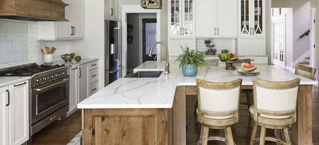
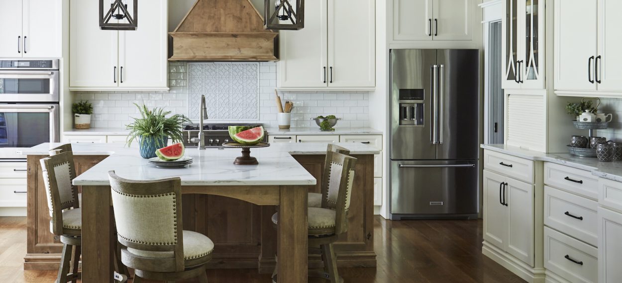
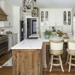
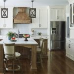
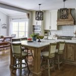
It’s actually mine! We have a craftsman-style house that combines a bunch of different looks and feels and we wanted something that was clean and timeless, so we went with Madison Flat Panel doors. We also wanted to include a rustic feel with knotty alder Cappuccino, which goes really well with the Divinity Classic paint.
What design challenges did you face?
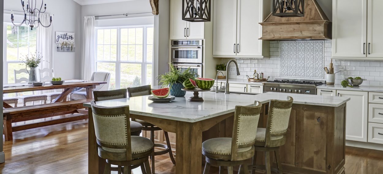
This kitchen presented a challenge in the sense that it was an open floor plan between the kitchen and living room. I had a good amount lineal space, but I was limited on the width due to accommodating oversized walkways. I liked our open floor plan, but with how the kitchen was shaped, a traditional rectangle island would have left a big void between the living room and kitchen.
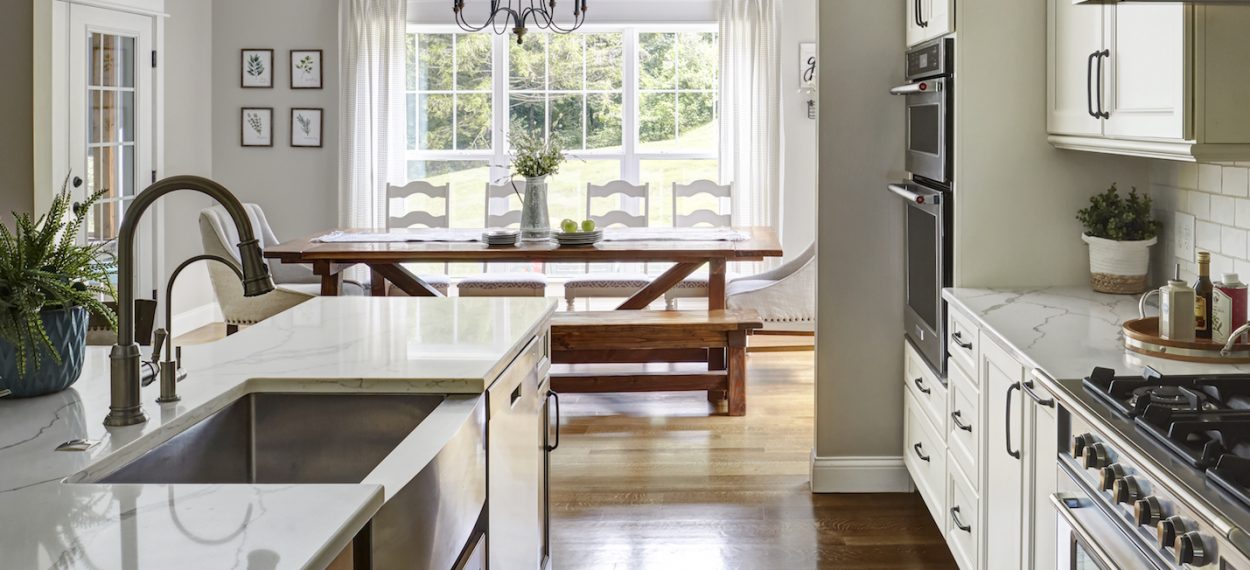
With two little kids, we spend a lot of family time at the island for snacks, meals and homework. Having space for plenty of seats was key! I was able to do a traditional-style island with a sink and dishwasher, but I extended a table setting off the back of the island. By stepping it in more narrowly, the stools are still out of the walkway, even when someone is seated at the island. Doing the “T” shaped island also allowed me to take up the lineal space between living room and kitchen, but keep the island at an appropriate size.
Did you use any unique products or modifications?
I wanted to extend the two-tone look to the hutch-style cabinets on the one side of the kitchen for coffee storage. Since Medallion doesn’t currently offer a two-toned interior, I ordered glass with no finished interior and also ordered skins and shelves in knotty alder to be put together on site.
Why did you decide to use Medallion in your kitchen?
I’ve been good partners with Medallion for a long time—I like your product. Medallion is ahead of the game most of the time on finishes and colors, too. No other line carries the look of Cappuccino on knotty alder, no one else had that combo. It goes with our floors, too.
What did you like best about this design?
My favorite part is the flow of the kitchen with those wide walkways. The gap between the sink and range is 48,” so there’s plenty of room for multiple cooks. It’s inclusive with the island, too, people can sit at it without being in the way.
What’s your favorite part of designing with Medallion?
Since I’ve been designing with Medallion for so long, it feels very familiar. There’s a wide array of door styles, and Medallion is always coming out with new colors. In fact, you’re on the front end of coming out with new colors; other cabinet lines tend to follow where Medallion leads.
Show us your work!
Do you have a favorite cabinetry design using Medallion?
Send us high resolution images with a short description of your project and you could be featured in our next Designer Showcase.
Submit Project
Any advice for kitchen designers who are just getting started? Or advice for anyone designing in 2020 and beyond?
Keep trying to do what you do, eventually this has to break loose—enjoy the demand! We’re busier than we ever have been. Take the good part and enjoy it, keep your head down and deal with the bad and eventually it’ll work itself out.

