Designer Profiles: Jon Martinez
"Medallion is my go-to product because of the diversity of the catalog. "
What was your design inspiration for this space?
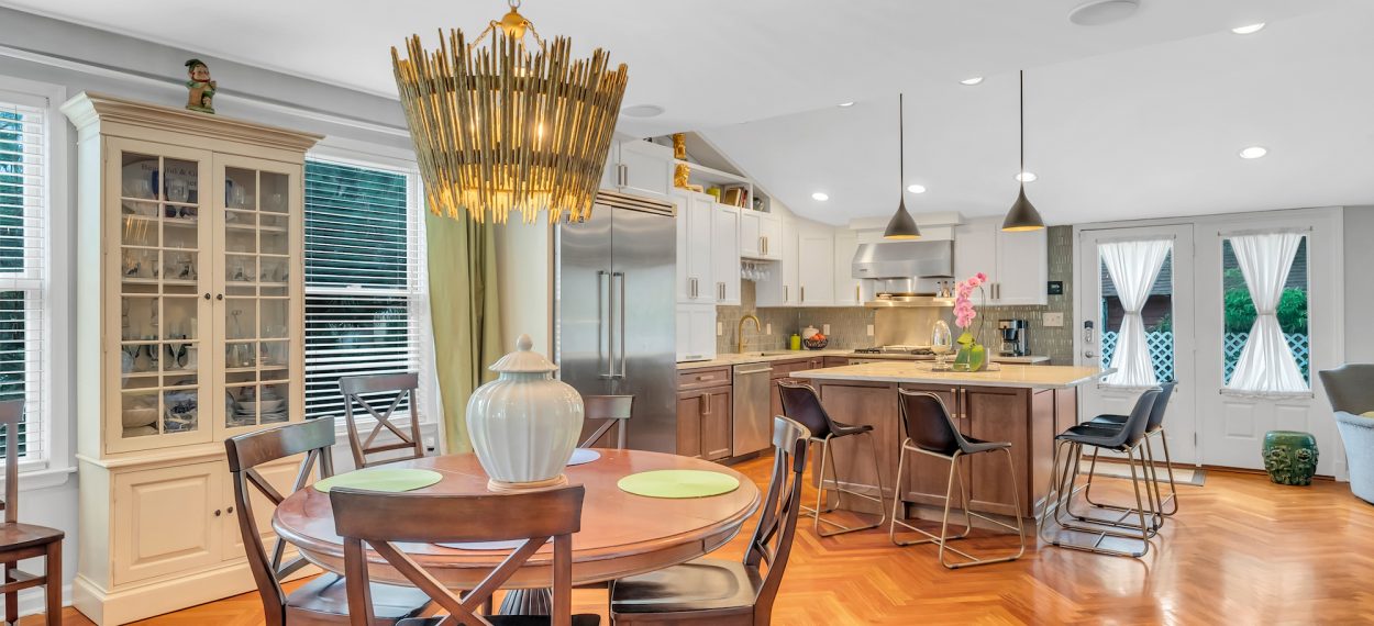
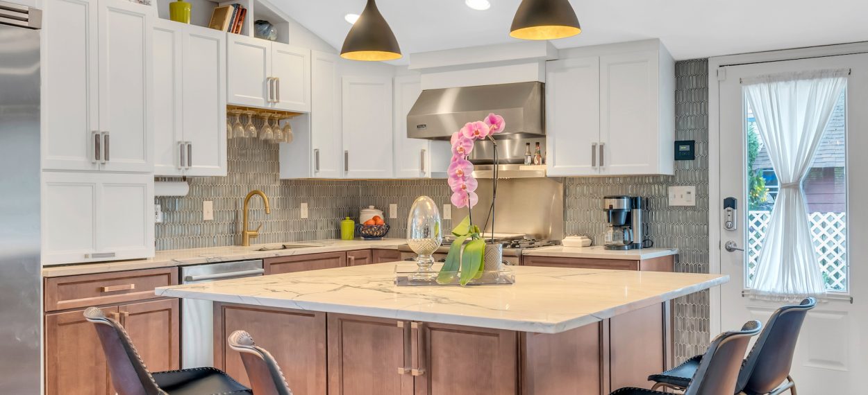
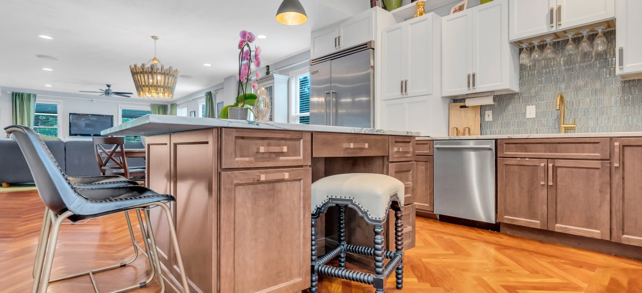
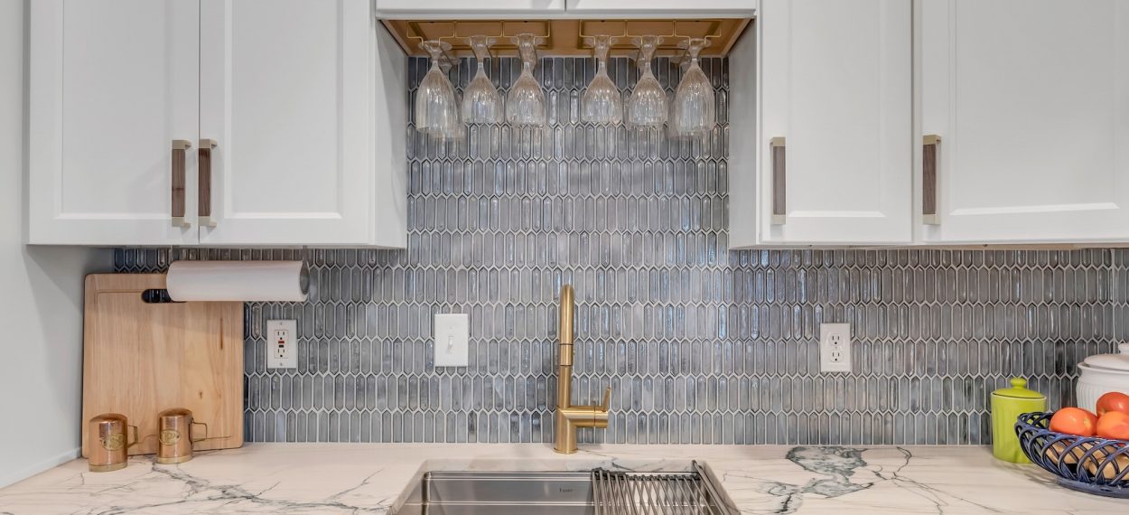
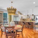
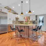
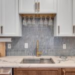
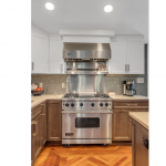
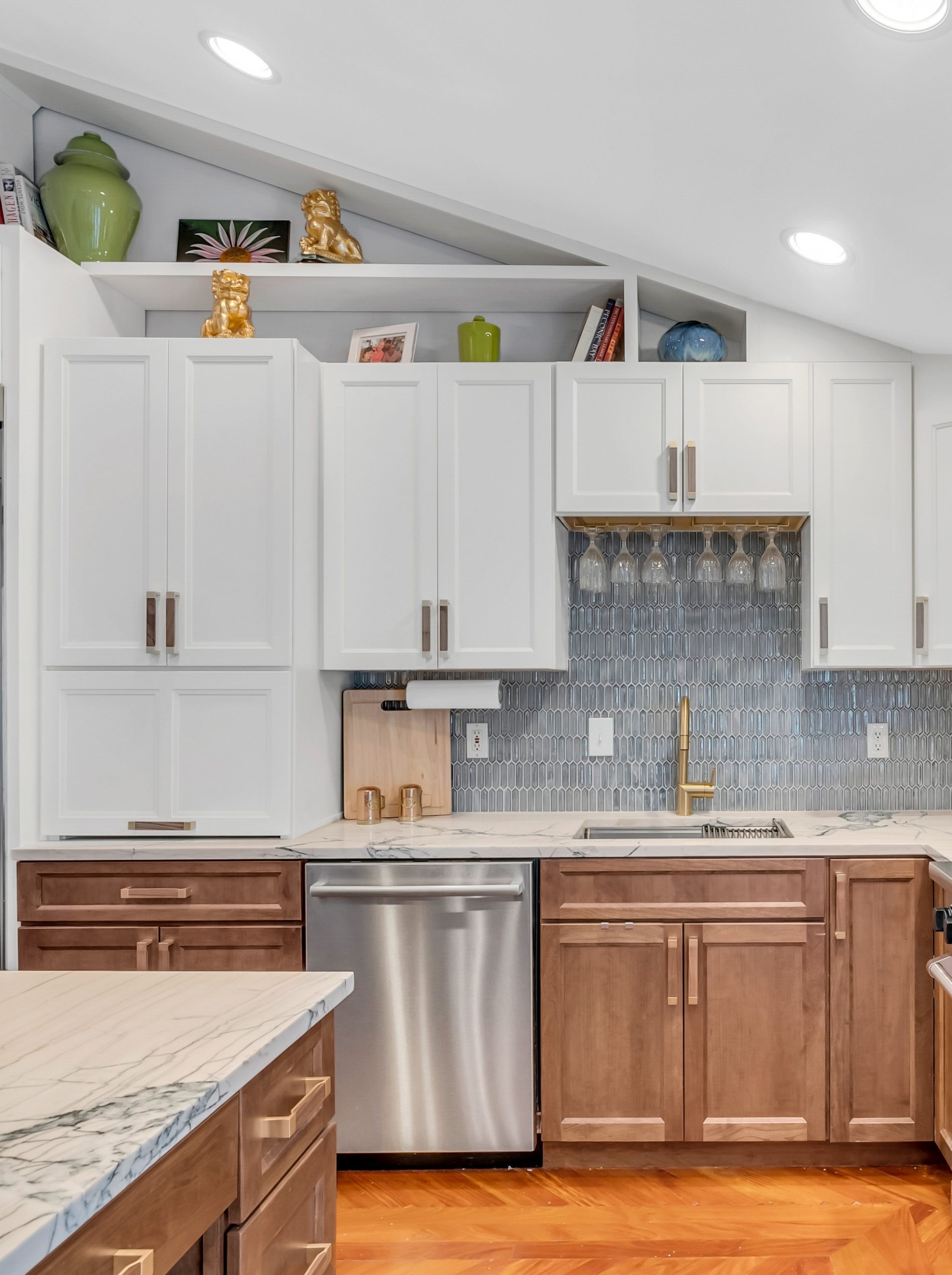
This happens to be my own kitchen! We wanted to keep it contemporary and modern but timeless, too. I love the clean lines, the wood elements, and the way all the details came together — I even found that Eagle Rock was a perfect match with our walnut hardware!
What’s your favorite part of your new kitchen?
I mean, everything! I love it. It’s great how it all came together, and I love the quality of the cabinets and all the additional storage. It was almost a 50% increase in space!
Did you use any modifications or customizations?
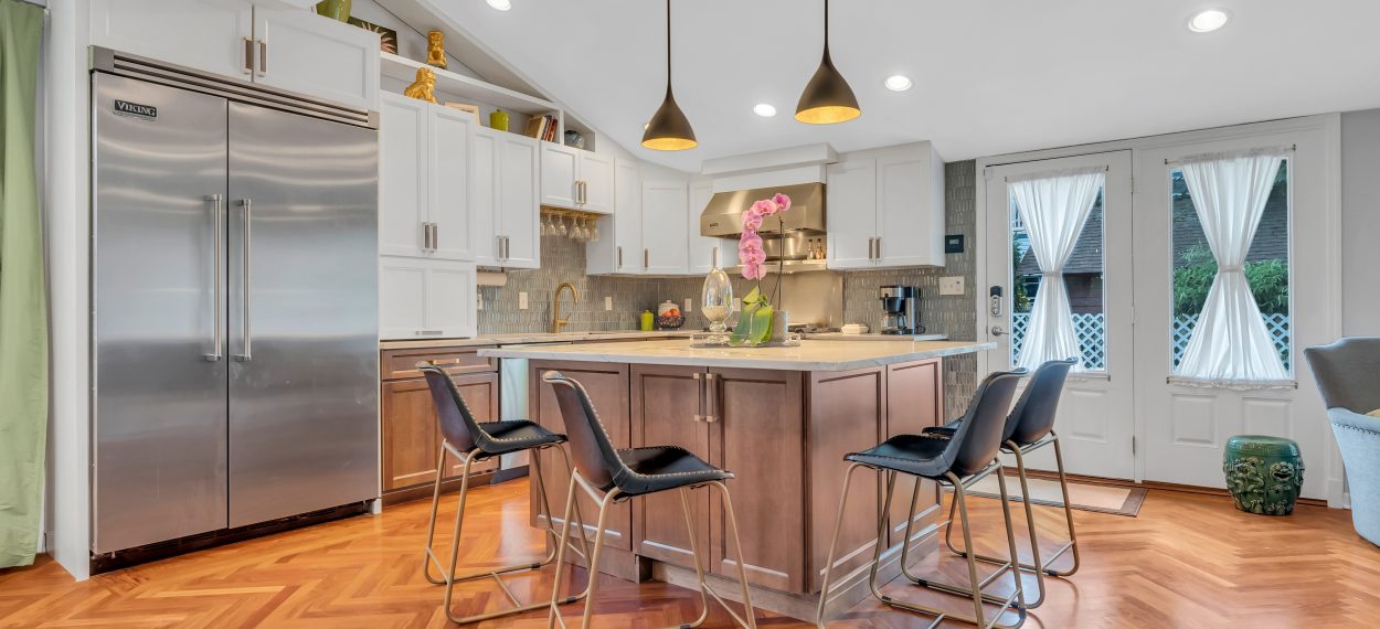
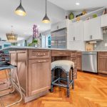
The chef’s niche is a design addition that I always want to use, but it’s hard for customers to envision it. I hate having too many chairs around the island, so I put in this stool for extra seating that tucks away under the counter. Having that seat lets the person cooking sit down and talk with people and it also works as my makeshift home office. I pull out my laptop, put it on the countertop and just lay everything out on that six-foot counter space.
How did you design around the pitched ceiling?
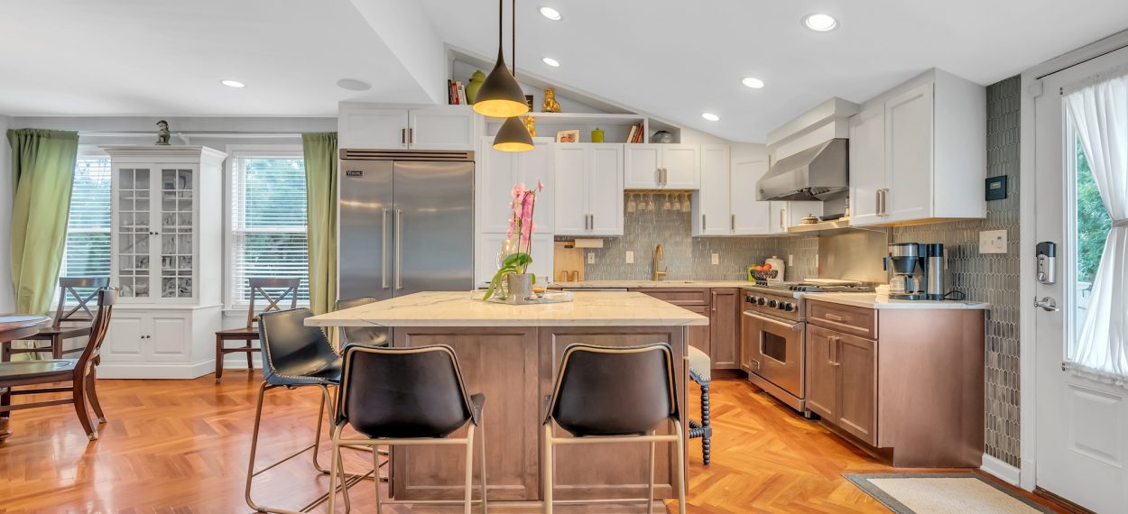
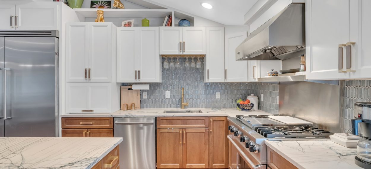
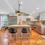
We wanted to use the full height of the ceiling, which is about ten feet, so I used staggered height cabinets: 30” on the one side and then 36” on the other side. That gave me an extra six inches of space. I also did open shelving above the top cabinets, which was a unique approach to bring your eye up and embrace the architecture. That triangle space displays art like those ceramics and my prized gold leaf foo dogs. The shelves are actually refrigerator panels, and we reversed the side so the finished side was exposed.
Sounds like storage was a priority! What other functional choices did you make?
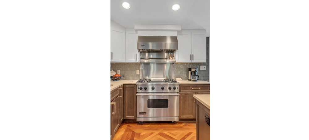
Every cabinet’s got something, it’s like a big promo for Medallion! I love being organized, I feel really good when everything’s in its proper place and things aren’t sliding around. We used rollout trays in everything, as well as a knife organizer, pot and pan drawers in the island, cutlery dividers, a garbage can pull out, a lazy susan, and a utensil insert. We also hid the microwave with lift up cabinetry to keep the countertops clear.
Show us your work!
Do you have a favorite cabinetry design using Medallion?
Send us high resolution images with a short description of your project and you could be featured in our next Designer Showcase.
Submit Project
What made you choose Medallion for your design?
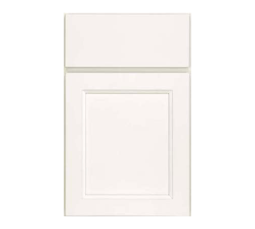
Medallion is my go-to product because of the diversity of the catalog. You don’t necessarily have to do a lot of customization, there’s just so much to choose from that’s just part of your standard library. And then there’s all sorts of doors, from heavily traditional to inset to contemporary. I love all the options for finishes and doors, there are literally hundreds. And I needed the customizable features to do the decorative end panels on the island and to achieve the storage solutions and the open shelving.
Any advice for new designers?
Listen to your clients’ needs and exceed their expectations. Don’t be afraid of making suggestions, because you’re the designer. They’ll just tell you what they want, and then your job is to make it as pretty and as functional as you can.

