Designer Profiles: Jen Church

Jen Church
"This was one of my favorite projects to work on. I knew this house was going to be filled with a lot of love, laughter, holidays, and family."
Can you share your design inspiration for this project?
This was one of my favorite projects to work on—not only did the client’s timeless and traditional style speak to my heart, but they were also one of the best couples I have ever had the pleasure of meeting. They were the testament to a lifelong, successful love story built on honoring traditional roles, and a husband still head-over-heels in love wanting to build his wife her dream home near family and grandkids. Upon meeting them, I knew this house was going to be filled with a lot of love, laughter, holidays, and family.
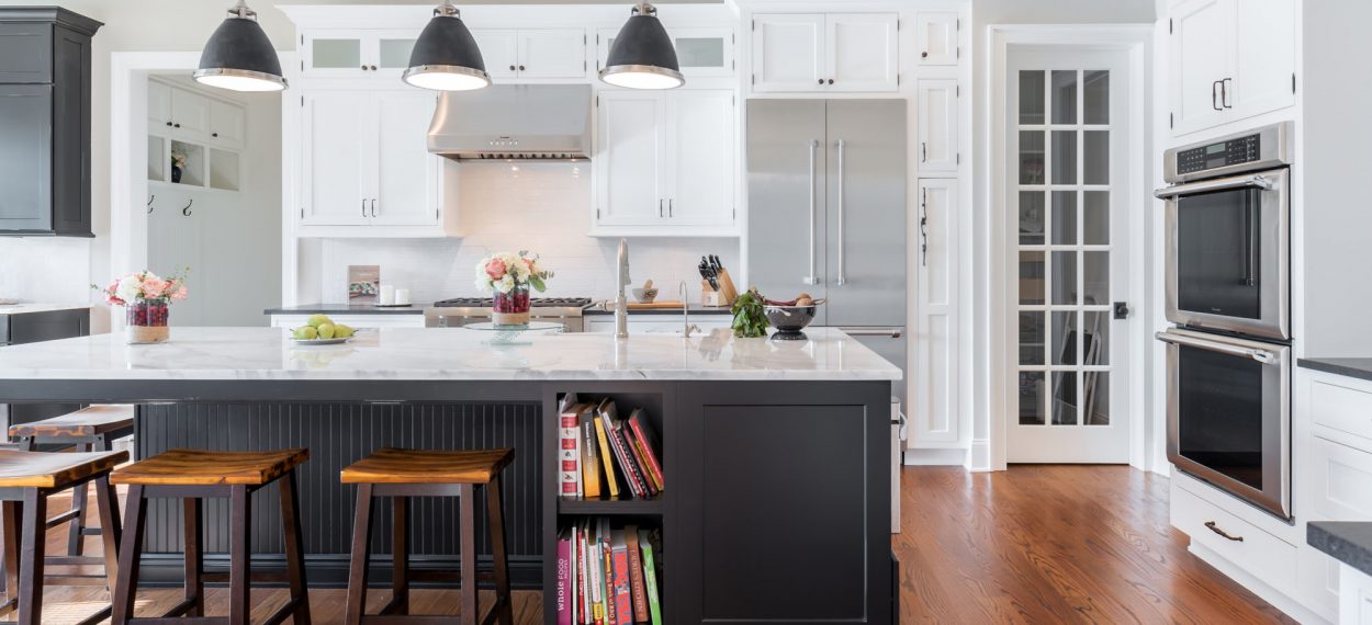
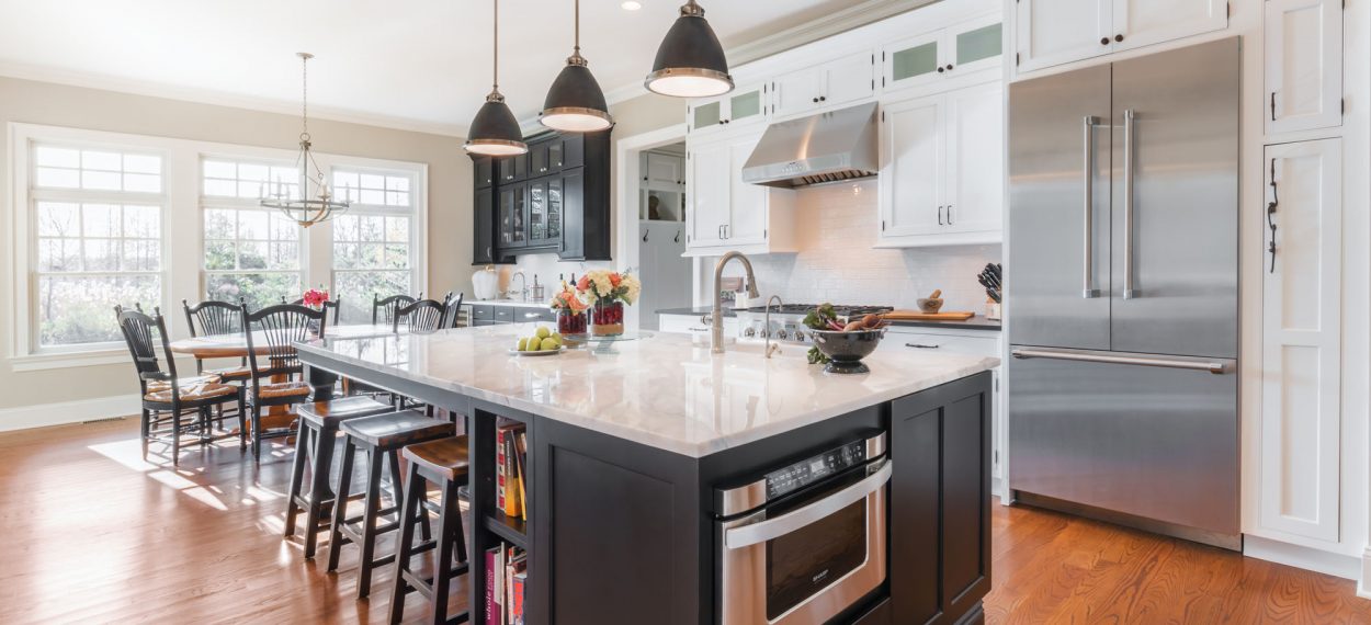
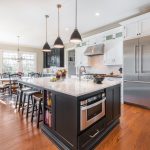
My goal was to open up the kitchen as big as possible into the family great room and create multiple work zones so there could be a lot of cooks in the kitchen at once. I quickly found out about her desire and love for inset cabinetry as well as a classic back and white style, which set me on an easy road towards this beautiful timeless look, set in a warm and inviting floor plan.
How did you use a product or modification to solve a design dilemma?
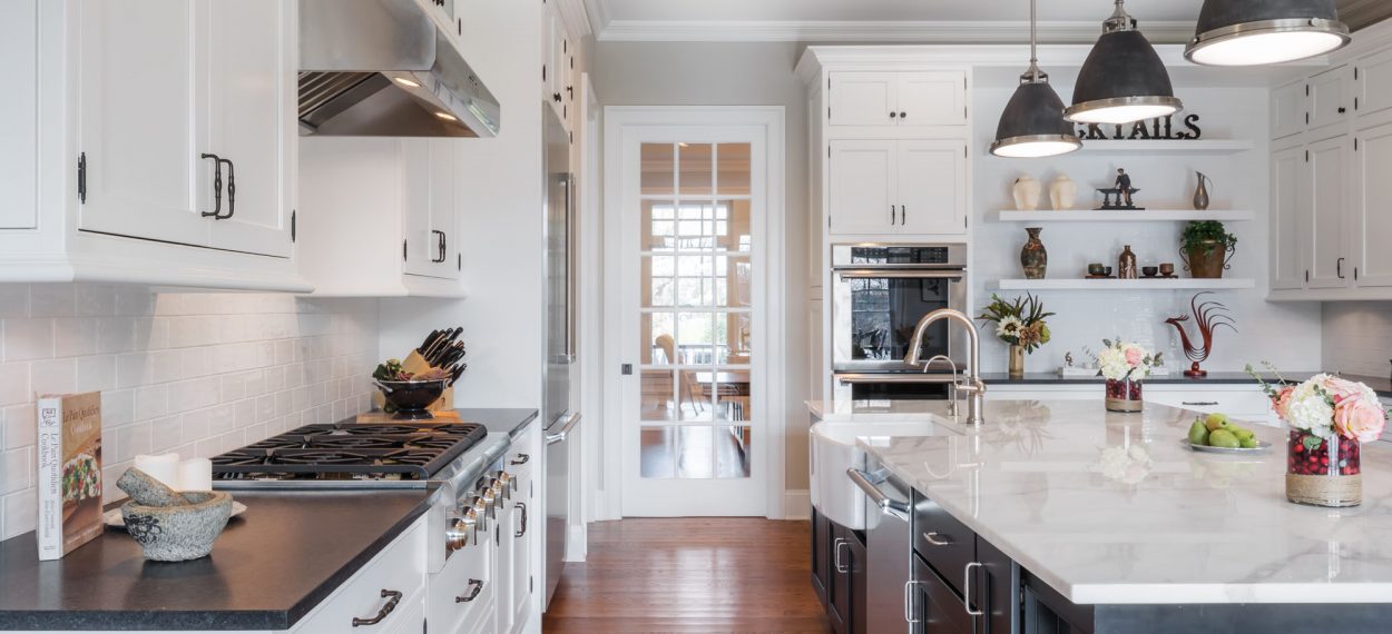
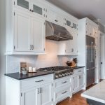
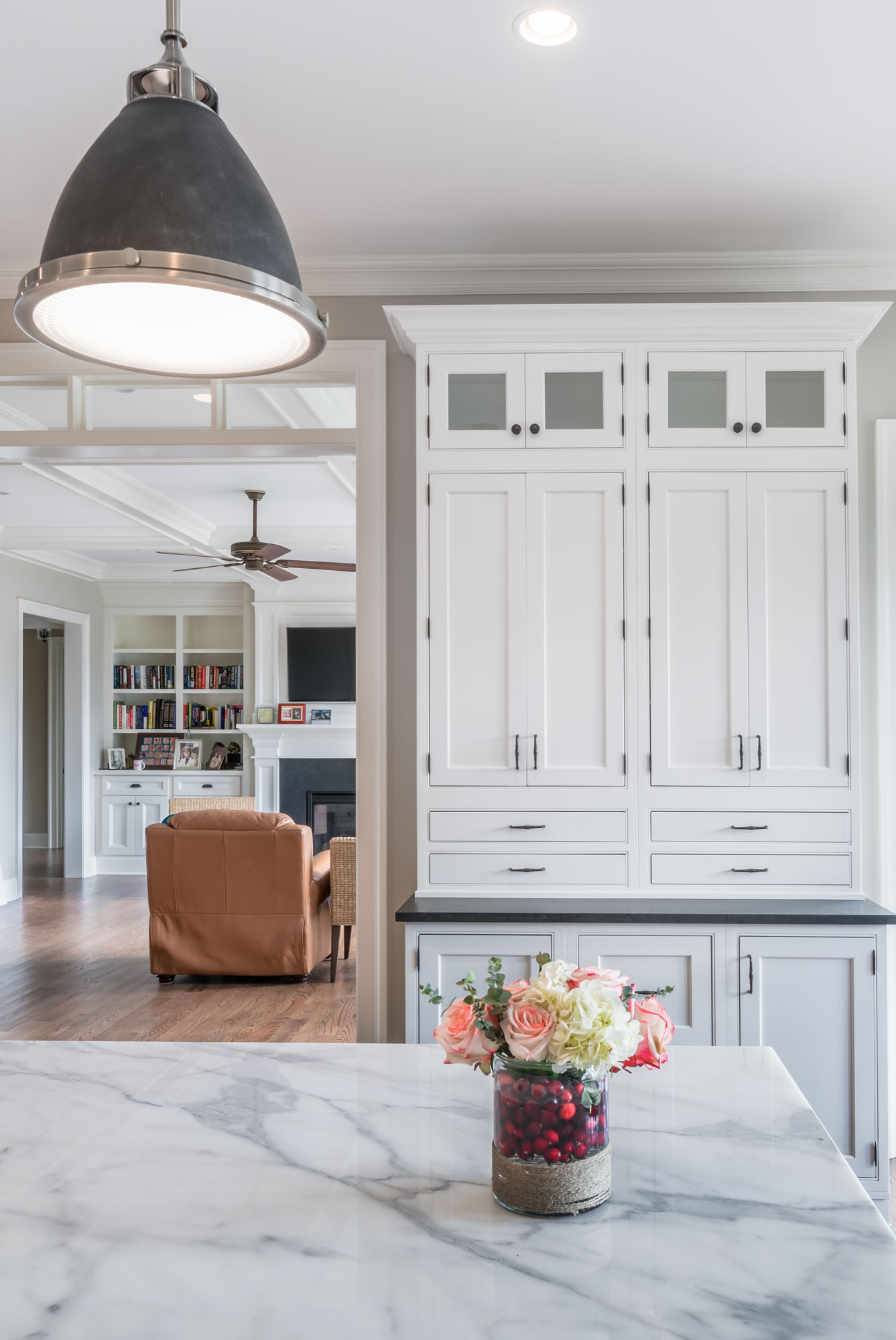
The house had 10’ ceilings, so I wanted the cabinets to look tall and to bring your eye up to focus on the open airiness of the space and its grand scale. I used standard stacked cabinetry and also customized some other units to be stacked in the factory; this created a clean overall look and was easy to install.
What are some of the functional storage solutions you chose?
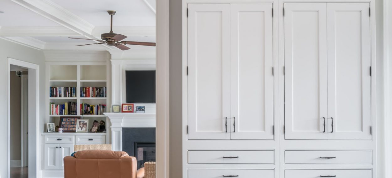
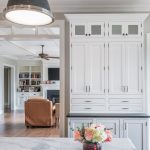
We needed the kitchen to marry fashion and function. The customers not only needed an area for display and decorating, but they also needed some file and office storage. I created a hidden office by using file drawers and counter wall cabinets with secretary drawers and we put that unit on a wall with the family room and fireplace as the backdrop. I knew it had to look like a decorative hutch or a built-in piece to blend the two rooms seamlessly! I also placed open shelves in their own dedicated space, making those shelves an unexpected focal point in the room.
What is your favorite part of designing with Medallion?
I like how Medallion has a versatile product line with customizations and options that your customer wants and needs. It’s not too overwhelming to learn and design with and it makes sense to today’s consumers.
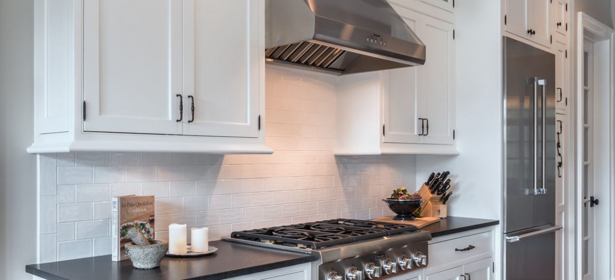
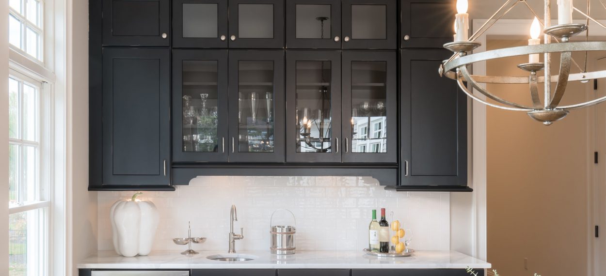
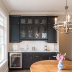
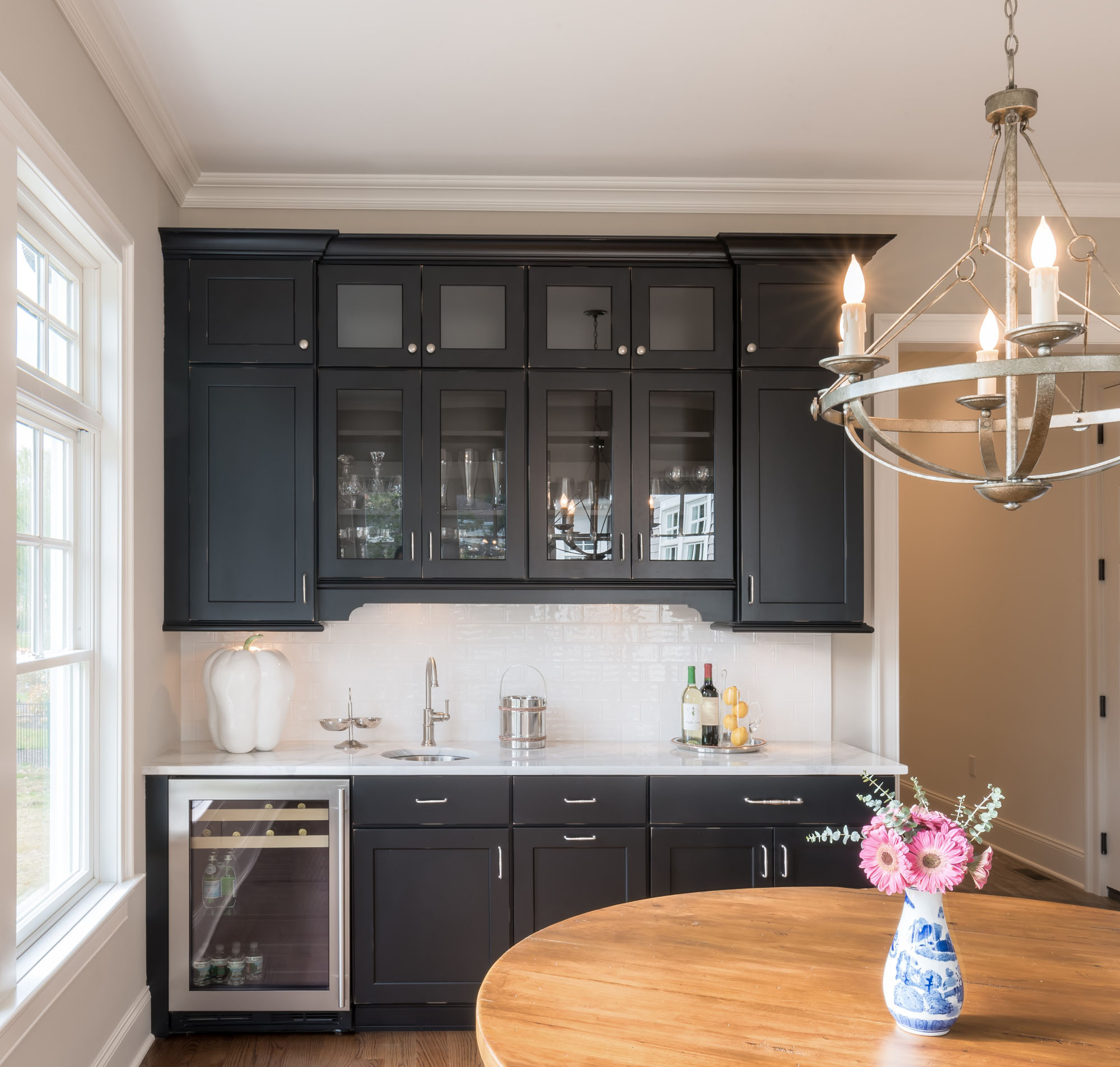
I used Medallion Platinum with exposed barrel hinges for all the white painted perimeter cabinets. In order to save a little bit on the budget, I capitalized on separate cabinetry pieces looking like gathered furniture pieces and I used full overlay doors from the Gold line in Carriage Black with Heirloom Distressing to give the cabinets an antique furniture feel.
Show us your work!
Do you have a favorite cabinetry design using Medallion?
Send us high resolution images with a short description of your project and you could be featured in our next Designer Showcase.
Submit Project
What did you like best about the design?
In such a big, open, unconventionally-laid-out kitchen space, we filled each wall with unique style, thoughtfulness, and functionality. To me the space feels so warm and inviting and it truly feels like the heart of the home.
Any advice for kitchen designers who are just getting started? Or advice for anyone designing in 2020 and beyond?
It’s normal to be nervous about a project, no matter how long you have been designing. Those nerves or challenges push us designers to be better and learn and grow. Try out some new ideas when you have the opportunity—you may surprise not only your clients, but also yourself!
Anything else you’d like to add?
I appreciate the recognition! It is nice to take a moment of pause, reflection, and appreciation. I am grateful to have stumbled my way into a career that truly feels like my heart and my home. It is true when you do what you love it does not feel like a job!

