...
Details that Make a Difference: Decorative Metal Doors and Inserts
read more

While working with white might sound easy, the reality can be far from it. Designers know every white isn’t just “white.” Its palette is vast; its range—crisp, creamy, bright, warm, and more—is challenging; and incorporating it into a concept can be complex.
With this in mind, Medallion has worked with our design team to explore the full spectrum of this versatile color in search of true whites and tonal whites, and to craft the five unique finishes you see below. The results? Beautiful, distinctive looks every homeowner can achieve.
Whether starting with white or applying it as a complement to other elements, be sure to take time choosing the right one. Certain shades of white show variance through nuanced undertones that pull color influences from and reflect surrounding materials. For example, using a white finish against another white design element with its own tonal character—say a high-end sink or marble backsplash—can unexpectedly play with the eye of the viewer.
And then there are influences from various lighting. Whether it’s day versus night lighting, the direction of the light source, even the bulb type can impact how the human eye interprets whites—and potentially change the intended look of the space.
Notably, trends are shifting away from the long accepted bright white to warmer whites. And depending on other paints or stains you may be using, the appearance of your countertop, wall hood, or accessories—which can pull blue, pink, yellow, gray, or other undertones—various shades of white can present in all sorts of ways.
A lot to consider, yes; but it doesn’t have to be overwhelming. If you’re designing with white and need an assist, check out Medallion’s Finish Folio for gorgeous options like Divinity, Irish Crème, and Magnolia. Or let us help you craft a signature look by combining one of our Medallion whites with some undertones of your choosing through Medallion Finish Select.
It’s a color with endless application, and endless variation. Selecting the right white for your project takes patience, careful consideration, and an understanding of the possibilities that define it.
A LOOK AT OUR WHITES
Sea Salt
Our whitest and brightest white
Magnolia
A rejuvenating, elegantly refined white
White Icing
Bright and crisp with just a hint of grey undertone
Divinity
A creamy white with a tint of pink warmth
White Chocolate
A classic, smooth white with slight tones of almond


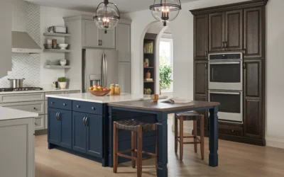
Add a pop of color with a vibrant color choice – like Marine and Lakeshore. Bright colors can make a statement alongside pure, bright shades whites like our Sea Salt.
Magnolia marries well into a room when designing with earthy shades –like Eucalyptus or Macchiato. The rich hues of these finishes will bring in an opulent touch of nature and a true elegance to your space.
Create a tone-on-tone design by layering two or more similar colors together. For a great match up, try White Icing with our palest blue-grey, Billow, to deliver this popular look.
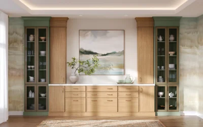
Infuse warmth and sophistication into a space with light brown neutrals like Cappuccino or Biscotti. These colors can help create a harmonious and inviting aesthetic when used with a creamy white like Divinity and help bring out natural features in woodgrain.
Create a layered effect by blending similar finishes together in a space. Use Silver Appaloosa to eloquently echo the subtle tones of almond in White Chocolate. And contrast with a supporting stain like Dockside to showcase areas of a room.